Monday 18 May 2015

Preparations for Assessment:

Preparing all the work for assessment took a long time and a lot of consideration. I wanted to show the progression from the source image to the textile piece. I hope I managed to present my work comprehensively. I am really proud to finish the course and I do hope for a pass. Here are some of the boards I am sending for assessment:

S Payne - Assignment 1
S Payne - Assignment 2
S Payne - Assignment 3
S Payne - Assignment 4 
S Payne - Assignment 5
Some final reflections:
  •          Sketchbook: Like many students I was apprehensive about drawing in my sketchbook. I can draw and I used to draw but overtime I stopped. I found myself frustrated a lot. Partly because for textiles, I want to record more detail and my skill level frustrated me. Partly because I didn’t have enough time and I wanted to get things done quickly. However, drawing is like another skill. It needs work and time put into it. You need to exercise your skill or you loose it. Throughout the course I got more confident and dare I say a little better. 
  •         Blog: My tutor advised me to post often but shorter posts, which I completely agree.
  •         Time management: Time is short for everyone but with two young kids I struggled at times. I came to conclusion that I shouldn’t get stressed about what I cannot change. Instead I need to focus on what I achieve despite all odds. I learned a great deal during this course and learning more excites me. The more confident I get with the techniques the quicker I will become. 
  •         Networking: Distance learning can be isolating. To combat that I need to network more. For the next course, I will make more effort to engage more.


This will be my final post. I'd like to thank my tutor Rebecca Fairley. She has been very supportive. Now I look forward to my second course.

Learning Log for Assignment 1 and 2:

I have been busy preparing all my work for assessment. After putting everything together I wanted to make sure that my learning log for the first two assignments appear in my blog too.

At the beginning of this course, I started with a traditional notebook for my learning log. It was great fun but soon I realized that blog is a better medium. It is easier to share images, resources and experience. My tutor encouraged me to go ahead.

But this causes a little confusion. Learning experience for the first two assignments are in a notebook and last 3 assignments are on the blog. To avoid confusion I decided to put my previous learning log on the blog too.

I don’t want to create more work for myself; therefore I will share the pictures of my learning log here. (I am also sending it to the assessors.)
Here are my earlier experiences:

S Payne Learning Log

S Payne Learning Log

S Payne Learning Log

S Payne Learning Log

S Payne Learning Log


Monday 9 February 2015

Assignment 5: A Piece of Your Own

 The skin: The Armour

My theme is animal skin and I associated it with identity because I believe the use of animal print is a good example of how we communicate our personality via borrowed image and its associations. I started with researching into artist who worked with the concept of identity. I discovered that it is a huge and complex subject, which could be approached from different angles (psychological approach by Lois Bourgeois, sociological approach by Grayson Perry, personal and gendered approach by Cindy Sherman etc.) I realized that for me to tackle the subject I need to approach it in simpler terms. I also researched the use of animal skin in fashion. I really liked Alexander McQueen designs, how he used multiple patterns and colors to enhance the shape of the garments. My strategy to simplify has two elements:
  •  Narrow down the visual source (to reptile skin -iguana)
  • Note down the words/adjectives which are associated with animal skin and identity then come up with visual representation for them:  Animal skin: wild, daring, sophisticated, glamorous, edgy… Identity: constructed, fragmented, vulnerable, robust ever-changing, layered…

Saadet Payne
Saadet Payne
I started sketching reptile skin particularly iguana. I chose one image and worked on it, with different media, water-colour, collage, charcoal, ink, etc. Soon I realised the cellular structure of the skin and its multiple geometric shapes. It is like a grid. I decided to work with this and produced some close up drawings. 

Saadet Payne - Close up Drawing
Saadet Payne - Close up
Then I decided to have a go at printing, machine embroidering and smocking. Hence fabric manipulation via smocking produces very cellular, repetitive, raised surface structure, which I thought would represent reptile skin nicely. And the whole process of construction a surface bit by bit, I thought, would sit nicely with construction of identity. I haven’t tried smocking before. Resources from following websites were useful with instructions and stitch patterns:

At this point I am thinking to combine machine embroidery and smocking together, planning of making a clutch bag.

I stared to make some surface designs for it. I experimented with different fabrics (cotton, cotton voile, organza, and silk). I began with colors loyal to my visual source (blues, yellows, greens). I dyed the organza and the interfacing two different colors and sandwiched them. I bondaweb-ed cotton with organza.


After couple of failed attempts with machine embroidery and printing I felt a little disappointed and lost. The machine embroidery over smocking samples were not good enough and prints were not that exciting. I didn’t want re-produce the same animal prints that can be found in mainstream fashion. I also realized that reptile skin is almost always used in accessories as bags, and belts. So this route is becoming to be unappealing.  I am not sure about colours either.


After a little break from the project, I tried to look with fresh approach and decided  to make a snood, wrap. I felt this was a little risky because making a surface for a clutch bag would have given me the opportunity to really add on the surface more layers and textures and colors. Now it is a wearable, I felt that it needs to be subtler.


From there on the object of design dictated the decisions: fabric (silk), colors, shape. Back to researching again trying to understand how designers used fabric manipulations (and smoking) in recent catwalk. Traditionally smocking is employed in children’s dresses and cushons. Surprisingly smocking is not widely used in mainstream now. I guess because hand sewing is not suitable for mass production and the amount of material used for smocking doesn’t make the cost of the garment competitive in a fast paced inexpensive fashion turnaround. I think smocking can be perfect for haute couture or costume applications. Here is a costume example from TV drama series Games of Thrones.
Costume from TV Drama - Games of Thrones
There are however interesting designers who used various fabric manipulation techniques to produce very cutting edge, sculpted and adventurous garments. I liked the work of following designers:
Iris Van Herpen Design
Iris Van Herpen: working with laser cutting, 3D printing, she produces very sharp yet feminine designs. Some of her garments look very Alexander McQueen-esque!
Some of her other garments reminds me of computer graphics; curtsey of 3D printing. Her innovative techniques explore new production possibilities which I am sure, will soon feed into high street fashion soon.
Alexander Wang - Vouge February 2015
Alexander Wang - Collection for Balenciaga
Alexander Wang: His latest collection for Balenciaga has crisp geometric lines (with cording, fold/pleating, cutting out, some smocking). Yet fluid and feminine; sporty glamour look. 

Liu Fang: Her knitted garments are very sculpted, strong and unusual. We associate knitwear with loose form yet her fabric manipulation creates very definitive shapes. She creates a contrast by using soft cashmere to achieve a strong definitive form. I only uses natural color of cashmere.

Looking at all works of all these designers; I can see one some common grounds: when designers use fabric manipulation it is the main design element muting other elements like color and pattern. The form achieved via fabric manipulation is there to take the center stage. 

I think I have spent most of my time researching but I guess it is an essential part of the learning process. After some consideration, I finalised my colour palate, dyed my fabrics and started constructing my piece. It was slow steady work. I decided that smocking produces very geometric structure and I wanted to introduce some organic element to it.
Saadet Payne - Outline design
I am planning 3 pieces put together with some beading at the very end. I am using two colours (grey and yellow). I am using silk. It is an expensive choice but I bought Chinese silk, which is much cheaper. Smocking with cotton can produce a hard surface; this would be ideal for clutch bag but not so much with wrap. It still needs to be soft. I experimented with cotton voile, much softer, but didn’t have the shine. I must have the light reflecting shine referencing to my beloved iguana skin.

Saadet Payne - Cording, pleating, cutting experiments
I sketched the outlines of the design of 3-piece fabric put together. The piece will have two faces. The back will be the same as the front. 2 pieces will be smocked with 2 plain colours. I am not quite sure about the middle bit. I tried cording and cutting/slashing with not much success. To introduce some chaos and organic nature to my geometric smocked pieces, I decided to play with uneven pleating.


At the beginning I was thinking to use printing and embroidery but I ended up with all fabric-manipulated cloth. Here is the final result.

Saadet Payne -Final Piece
Saadet Payne - Detail from Final Piece

The whole design process had twists and turns, joys and disappointments, trials and fails. I tried my best to use this as a learning opportunity having a go at techniques. I was much slower then I liked partly because at this stage my visual predictions of ‘how a certain technique will turn out’ are still premature. Same can be said about my ability to master the techniques. I am happy with the result but I fear it may be too simple. But keeping it simple was a conscious decision. I wanted to produce something that could be sold in a shop and be worn by someone. Something that can be used multiple ways, wrap, snood, scarf… I wanted to make the user feel glamorous, adventurous, and cozy, with a touch of luxury. I wanted to make her comfortable in her own skin.

Saadet Payne - Final Piece
I probably travelled further away from my starting point. I tried not to be too representative yet hopefully managed to incorporate some elements of the original concept. I could have used my prints as well. If I were to do this again I would try printing route again with maybe different printing techniques (wax resist, screen printing or maybe working on the piece as if an artwork and then photo printing it onto silk etc..). As I mentioned this is a huge subject open to many approaches. 

I really hope I have done enough to pass. I'd like to call the final piece "The Armour". 
Now I am looking forward to my next course already.


Monday 24 November 2014

Project 10 Research Part 2: Animal Print in fashion and Design

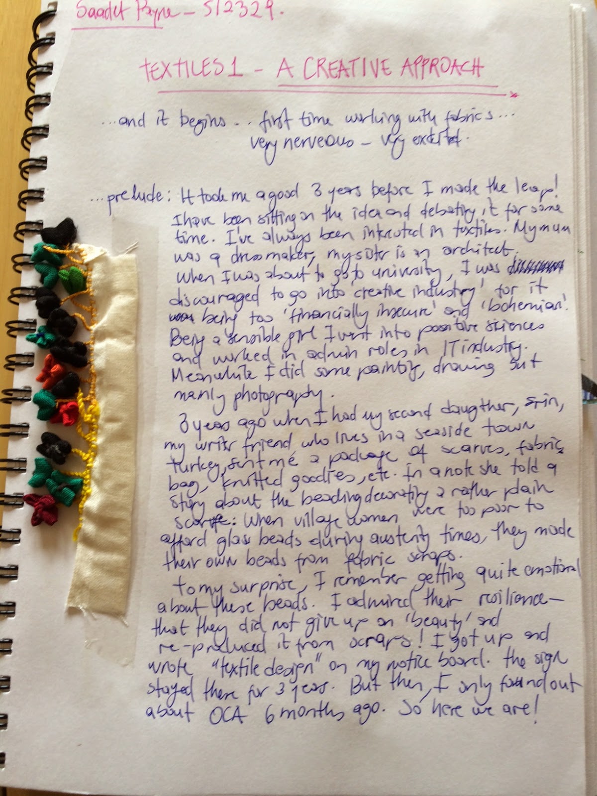
Brief history of Animal Print:

Unless other trends, which come and go within the fast rotating fashion seasons, the “animal print” a firm fashion stable. Its use is widespread from clothes to wallpaper, shoes to dinning plates, from lingerie to stationary. Famous fashion houses like Versace, Prada, Dior, Dolce and Gabana, use animal print regularly in their collections.


Looking back in history the wearing of animal skin was a necessity for warmth and protection. Over time it developed as a symbol that represent wealth, and social status. Animal skin and fur like leopard, cheetah, leather from snake or crocodile are expensive and exotic materials, which can only be afforded by, privileged few. Kings, religious leaders, wore and use animal skin to demonstrate their power.

In 20th century high fashion designers working for Hollywood stars and high society associated animal with glamour (and sex appeal). From 1920s you could see actresses and pin up models wearing animal print; Scarlet Nixon, Bettie Page, Elizabeth Taylor, to name a few. In 1947 Christian Dior introduced a leopard print dress for the first time. He used this print in his collections regularly associating it with “sophistication” and “elegance”. So much so that American first lady Jackie Kennedy wore an animal print coat in 1950s. 1960s and 1970s both hippy and punk rock movement used animal print in more colour, correlating it with wild, daring, adventurous vibe of the these cultural movements. 1980s and 1990s it was a part of power dressing. In 2000s and 2010s its use has spread significantly. Animal print is now associated with qualities like sexy, chic, fun, dangerous, elegant, adventurous, primal, and powerful.

Left Betty Page, Centre Dior 1947 Dress, right Jackie Kennedy


Popular use of the animal print and its application to various products increased over the decades thanks to of the modern textile techniques.  Nowadays animal print and its texture qualities can be re-produced without animals suffering. Use of real fur and leather from exotic animals is becoming a rare practice and rightly so.
Versage Scarf
There are several suggestions regarding psychology behind the wearing animal print. One is that wearing animal print connects us to our primal past to our “inner caveman”. it is also suggested that animal print increase attractiveness because fear response increase “looking time”. Generally it is believed that the characteristic of the animal (like fieriness of tiger) is transferred to the wearer.

Over the years many fashion designers harnessed the power of animal print updated its use and gave it a new lease of life. Among many I was attracted to two in particular: Rudi Gernreich, and Alexander Mc Queen, both I thought were revolutionary designers.


Rudi Gernreich (1922-1985): Austrian born American an iconic fashion designer. Gernreich was one of the most influential designers who defined “the new woman” in 1960s. He designed for relaxed comfortable clothes embracing the body in motion. He used synthetic materials, jersey, introduced knitted swimsuit and no-bra. His woman was androgynous yet adventures and risk taking. I think he really wanted to challenge the “look” of the era and produced very confident designs with geometric patterns, sharp cuts, daring swimsuits, uncommon color combinations, mixed materials.  
Gernreich made a collection of animal patterned outfits (Dalmatian, giraffe, tiger skin), with matching tights and underwear in 1968. His use of animal print is more courageous and he helped to re-enforce the popular pattern’s rein in fashion, but this time for the cool, young and new woman.
Rudi Fernreich Animal Print outfits


Alexander McQueen (1969 – 2010): McQueen is described as the wild child of couture who put British fashion on the map in 2000s. His work is shocking, edgy, disturbing in some places and rebellious. He is known for his long, big budgeted and theatrical fashion shows.

Coming from a modest London family, he learned tailoring at Saville Road, worked for a theatre costume company Angels and Studied Fashion MA at St Martins. He was discovered by an aristocrat fashion editor Isabella Blow, who later helped him to establish himself in the fashion world. His early collections and shows have been heavily criticized for being misogamist and (e.g. Highland Rape Collection). 


My feminist bones don’t agree with his earlier shows either; but I recognize his skill as an excellent technician who dares to sabotage the tradition. He uses animal prints and birds as inspiration regularly. He cuts unusually defying convention (bumpster trousers). Isabella Blow in one interview said “He is a wild bird with a good silhouette”. He had a dark, wild side and expressed it in his design. V&A will be showing his collections this spring (2015) in an exhibition called “Savage Beauty”, a fitting tribute.

McQueen’s relationship with fashion world has been rocky but fruitful. He worked for big fashion houses Givency and Gucci and founded his own label. He won four British Designer of the year awards and a CBE. But ended his life unexpectedly in 2010 after his final show Plato’s Atlantis. It is this collection caught my attention.

In Plato’s Atlantis Mcquen uses animal print very differently. Usually animal prints are used true to the original pattern and colour. We see them as mono-prints as a re-production of the original and are used as uniform patterns on a garment.


McQueen on the other hand uses many colours. He puts reptile and insect prints from different part of animal together (some animals like crocodile have different patterns on abdomen, arms and back of animal). And he puts different animal prints together (snake with crocodile), making a kaleidoscope of animal pattern. He creates and explosion of color. He places patterns strategically to emphasize belly, skirt, bust or bottom. All in place to define the form and cut of the garment. I though this created balance among all the busy patterns. Some designs mimic bones and skull adding to wild and danger element. Yet I could make out a flower or two too. Some materials he use moves (I am guessing silk) some are solid keeping the form. It creates a fell that this particular pattern is designed for this particular garment. Not a pattern on fabric for multiple uses. It is an exquisite craftsmanship and I guess that’s why he is celebrated so much.

Researching his life and work was curious providing insight to fashion industry, how demanding, fast and ruthless industry it is. McQueen was producing 10 shows a year, and despite his entire attitude he was vulnerable subject to relentless expectation and criticism. I will make an effort to see his retrospective at V&A this spring.


Documentary 'McQuuen and I': https://www.youtube.com/watch?v=fNK2mKT8n9o

BBC Documentary 'The Works' - Alexander McQueen 'Cutting Up Rough' 1997: https://www.youtube.com/watch?v=542vMeyma4g

Notes to myself:

The concept of identity is big and wide and ever evolving changing, shifting subject. The use of animal print is an example of how we communicate our personality via borrowed image and its associations.

After all the artists and designers I looked into, how can I incorporate this knowledge into my design? I am afraid to simplify and reduce the theoretical and historical research I conducted. But I need to write some bullet points to get me started.

  • Identity is an ongoing process. Our visual interpretations change with it too. Portrait becomes a common medium to express identity visually. Feminists employ this strategy by putting themselves in the work making it a self-portrait. One can use this strategy by doing a tapestry. But I cannot really easily use this approach in a pattern. Therefore I plan to incorporate concepts associated with identity into the structure of the cloth. For example:
  •  vulnerable and sturdy: lace-like structure vs manipulated and raised surface (smocking, machine embroidery)
  • feels constant but evolving: (a background color – contrasted by bust of other colors but in smaller amounts)
  • using a varied versions of same pattern
  • ever changing: multi-use object to or a carry-able
  • layered: layers with embroidery and fabric manipulation

There is no point of re-producing well-used and well-known animal prints like, leopard, tiger, and cheetah. McQueen research has been a good lesson to see what you can do with a print.

At the moment I am inspired by reptile skin particularly iguana skin. It has different shapes and colors. I am at the early stages of my development

Next Step: Get sketching. Start making samples.